Meet the List of Links Builder: Your Page, Your Style
Create a link-in-bio page with a live phone preview, six themes, custom link icons, gradients, animations, and a contact form. Design its QR code before publishing, then share one address you can keep updating.
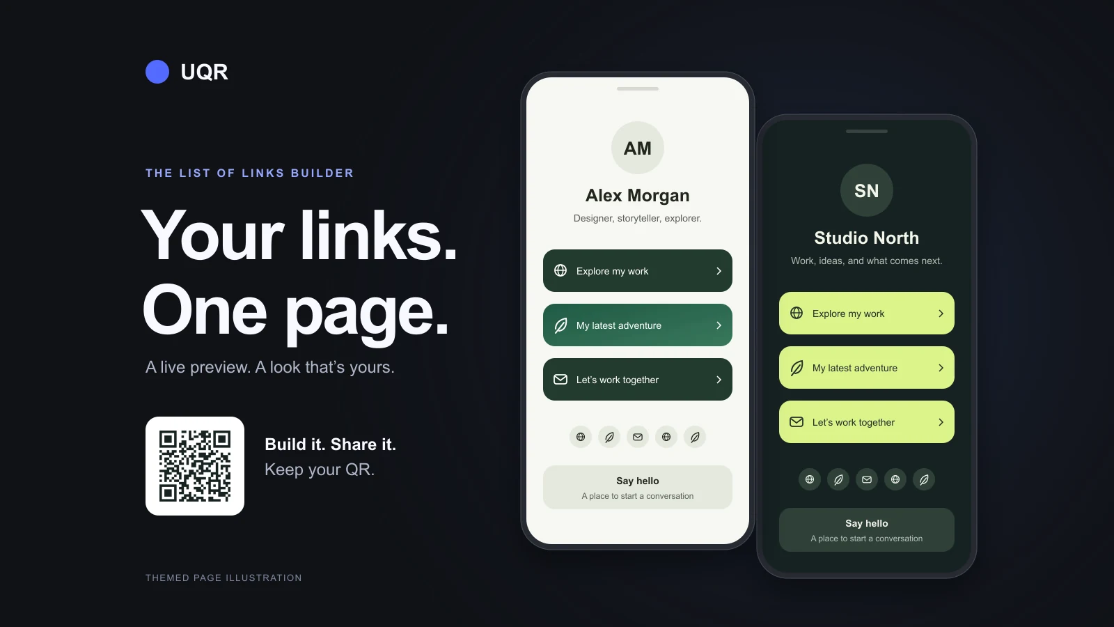
Your portfolio, shop, latest release, social profiles, and contact details can share one address. Put that address in your bio or turn it into a QR code for a business card, poster, or counter display. When something changes, update the page.
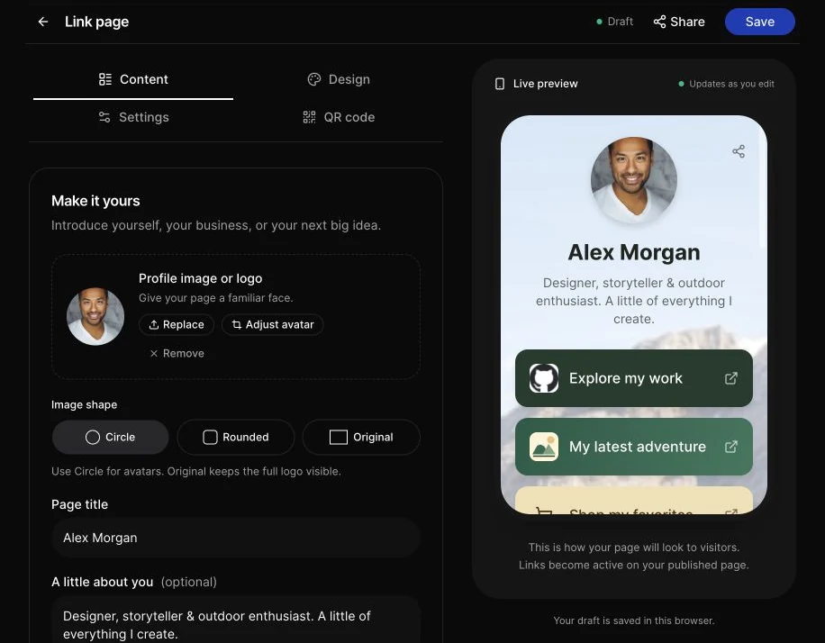
The new List of Links builder brings that whole page into one editor. Add your content beside a live phone preview, choose a look, customize individual buttons, and design the QR code before you publish. It also opens your existing List of Links QR pages, so you can use the new controls without starting over.
Open the List of Links builder to get started.
Four tabs, with a preview as you work
The editor groups everything into four tabs:
| Tab | What you can do |
|---|---|
| Content | Add your profile image, title, description, links, social profiles, and contact form. |
| Design | Choose a theme, adjust page and button colors, and configure your background image. |
| Settings | Give the QR an internal name and configure its short-link address where your plan allows. |
| QR code | Customize the code's appearance before your first publication or while editing an existing page. |
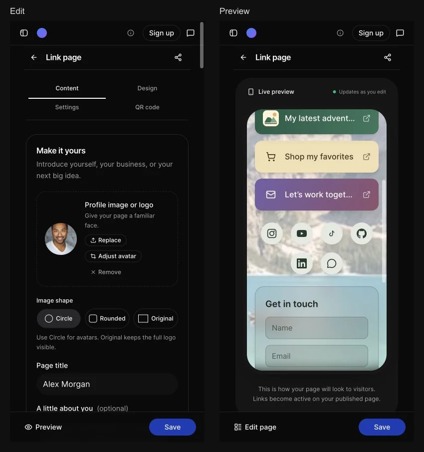
A compact Link page header keeps the draft status and publish or save action together. That heading stays the same while you edit your page's title. On desktop, the phone preview stays alongside the editor. On mobile, switch between Edit and Preview without losing your input. The save action stays within reach.
The preview shows the page's images, button styles, social icons, and contact form. Its links and form are inactive, so exploring the design will not open destinations or send a test submission.
An empty page shows an example of what you can build. The example is only a preview: it does not silently fill your form or become published content. Choose Try an example if you want to load its images, links, social profiles, and form into the editor and make it your own.
Add links, put them in order, and start fresh when you need to
Each link card starts with the two fields you need most: Link title and Destination URL. Add a website, a shop, an article, or a direct email, phone, or SMS link.
Drag the handles to change the order, or use the move-up and move-down buttons with a keyboard. The preview follows the order you choose. Remove a single card with its delete button, or choose Remove all links beside the count to clear the main list while keeping your profile, design, social profiles, and contact form.
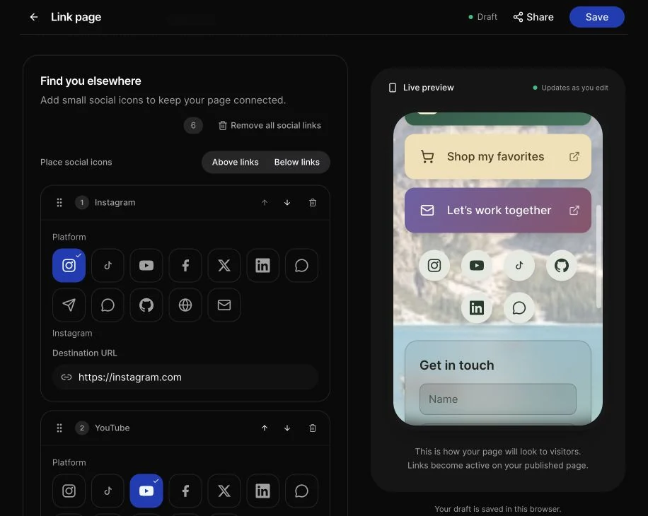
Social profiles have their own section, with an icon grid for choosing a platform. Position the social icons above or below your main links. The preview displays the full set, including pages with more than four social icons. Remove all social links clears that section independently.
Frame your avatar or keep your full logo
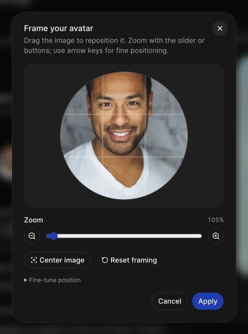
Upload a profile photo or logo and choose Circle, Rounded, or Original. Circle and Rounded give you an avatar frame; Original keeps the full image proportions, which is useful for a wide business logo.
For an avatar, open Adjust avatar to drag the image into position and zoom in or out. You can also use the arrow keys to move it. Center recenters the image while retaining your zoom; Reset returns to the initial framing. Apply when it looks right, or cancel to keep the previous crop.
The adjustment preserves the original image. Your chosen framing and shape appear in the preview and published page, and the page's generated sharing image uses those settings too.
Start with a theme, then make it yours
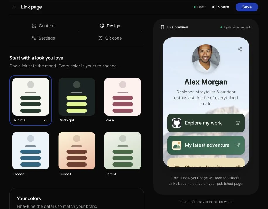
Six presets give you a starting palette: Minimal, Midnight, Ocean, Forest, Sunset, and Rose. Switching presets changes the appearance while keeping your content and uploaded images.
You can adjust the page text, button text, and social icon colors separately. Link buttons, the page background, and social buttons support solid colors or gradients. The shared color controls combine a swatch with an editable color value, so you can choose visually or enter a brand color.
Choose a font that feels like you
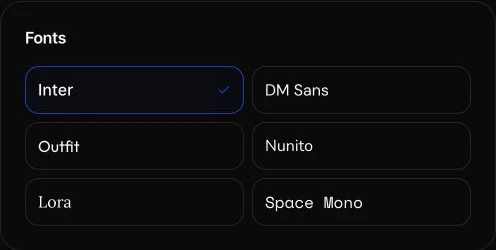
The compact Fonts grid displays each font's name in its own typeface. Keep the default Inter, or choose DM Sans, Outfit, Nunito, Lora, or Space Mono. These free fonts are hosted by UQR and apply to your page title, description, link buttons, and contact form. The live preview updates immediately, and switching a color preset keeps your font choice. Characters outside a font's coverage use a fallback font.
Give a background image the right placement
A background can be a photograph, a pattern, or an animated image. Upload PNG, JPG, GIF, WebP, or SVG; GIF and animated WebP files retain their animation.
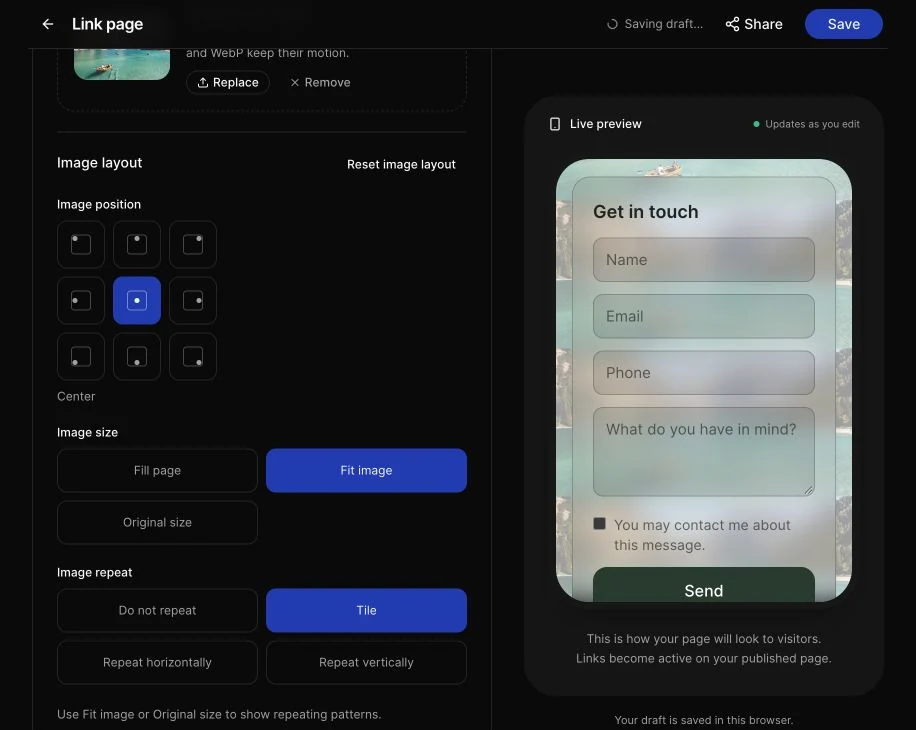
The image layout controls let you choose:
- Position: a nine-point grid, from top left to bottom right.
- Size: fill the page, fit the complete image, or use its original size.
- Repeat: no repeat, tile, repeat horizontally, or repeat vertically.
For a photograph, filling the page usually gives you a continuous backdrop. For a repeating pattern, choose Fit image or Original size so the tiles are visible. Your background color shows around fitted images and through transparent areas.
Give individual links their own look
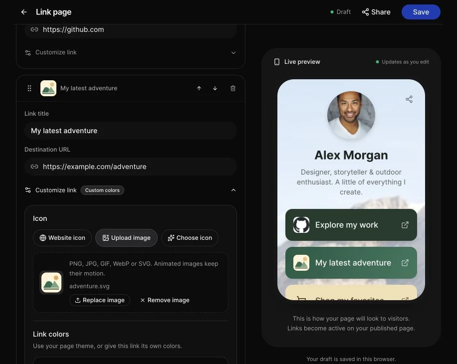
Open Customize link on a card to reveal its extra options. Every button uses your page theme by default, but you can give a particular link its own identity.
Website icons, an icon grid, or your own images
Choose a link's icon source:
- Website icon: detect the destination domain's favicon automatically, with a fallback when an icon is unavailable.
- Choose icon: pick a symbol from the visual grid.
- Upload image: use your own PNG, JPG, GIF, WebP, or SVG. Animated images keep their motion.
An uploaded product image can distinguish a shop link, while an email icon makes a contact button easy to recognize. You can replace the image or switch icon sources later.
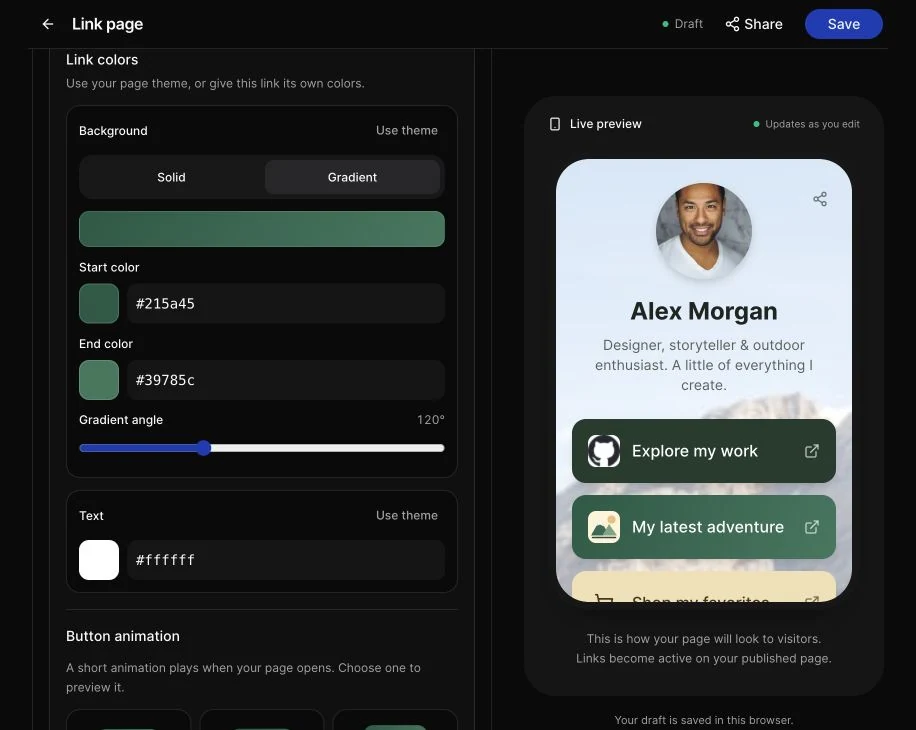
Independent colors and gradients
Override a link's background with a solid color or a two-color gradient, including its direction. Change the text color independently. A highlighted launch button can use a bright gradient while the rest of the page keeps the theme's quieter style.
Choose Use theme to remove a color override and return that setting to the page palette. Background and text inherit separately, so changing one does not reset the other.
Optional button animations
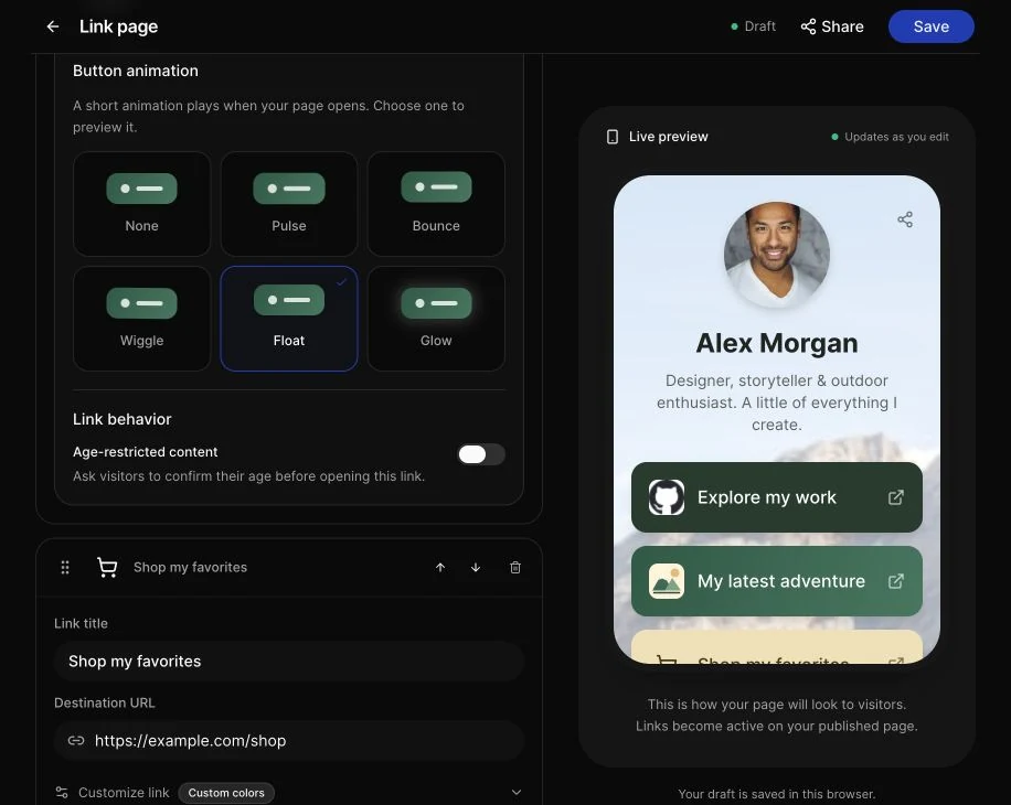
Choose Pulse, Bounce, Wiggle, Float, or Glow, or leave the animation set to None. These button effects play briefly when the page opens, finish after 4.8 seconds, and respect reduced-motion preferences. An animated icon image is a separate choice from a button effect.
The same options section also retains the existing age-restricted-content setting for links that need it.
Let visitors get in touch
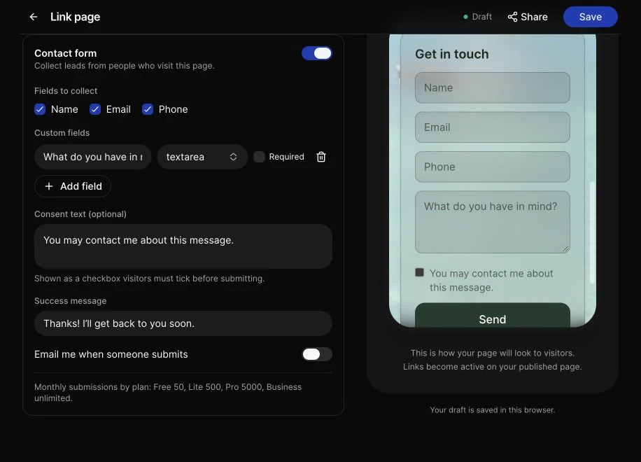
Enable the optional Contact form to collect visitor details on the page. Choose name, email, and phone fields, add custom questions, set a consent line and success message, and configure submission notifications.
The form follows your page theme. Submitted details appear in the existing Contacts dashboard, subject to your plan's lead-viewing limits. The editor preview lets you check how the form fits with your links without submitting it.
See contact forms on QR pages for the form workflow and plan details.
Design the QR before you publish
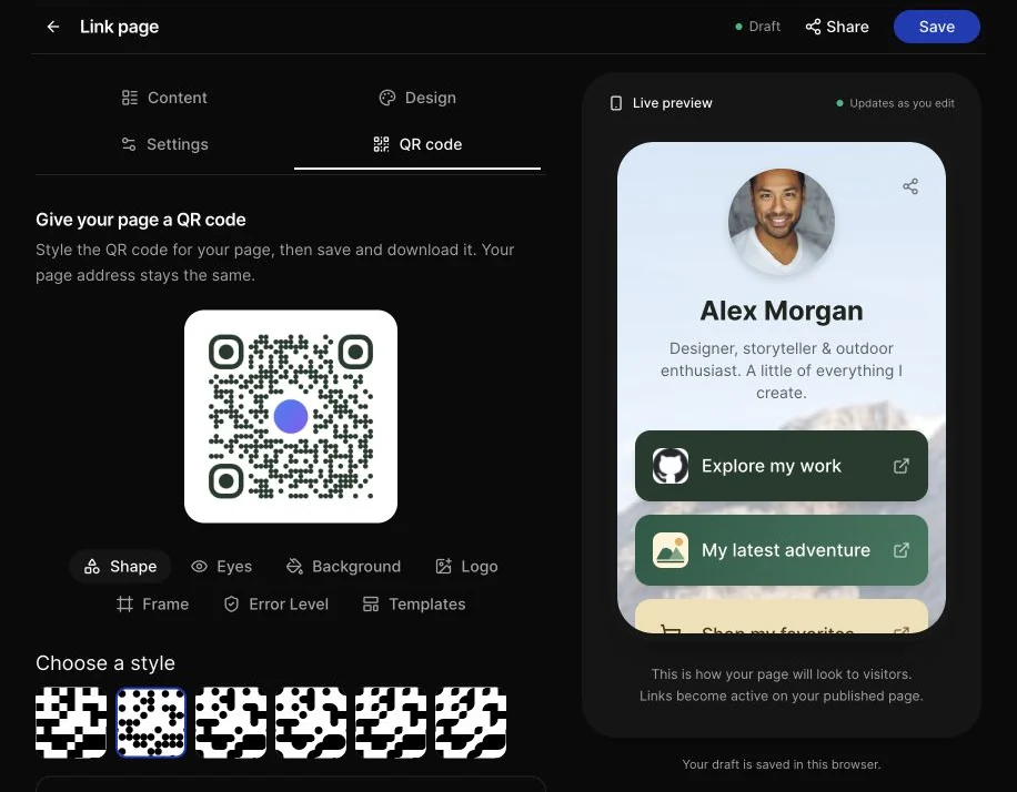
The QR code tab is available during creation. You can choose the QR's colors, pattern and corner styles, center logo, and frame while you are still building the page.
The page design and QR design are separate: your page can use a photo background while its QR uses a simple, high-contrast pattern. Both stay with the same record when you publish and return to edit it.
Before sending a QR to print, scan the downloaded design with a phone. Our guide to QR logos, colors, and frames explains the design choices that affect readability.
Keep unfinished work as a local draft
The builder saves unfinished work in this browser, including pending image uploads and QR design settings. Local drafts have a 24-hour lifetime and are kept separately for each user, workspace, and record.
When a matching draft is restored, you will see a notice with a Discard action. If the published record has changed since the draft began, the builder offers a restore-or-discard choice rather than silently replacing newer work. Restoring a draft never publishes it.
These are browser-local drafts, so they do not sync to another device. Clearing browser storage can remove them. Check the draft status before leaving, particularly if the browser reports that local storage is unavailable.
Publish when you are ready, then keep the same address
Use Settings for the QR's internal name and available short-link domain and slug controls. Address options follow your existing plan restrictions, and published addresses remain locked. Advanced link behavior remains in the existing link-settings editor.
Choose Publish page when your content and design are ready. The builder checks the current input and uploads your files through the existing upload flow. If something needs attention, it keeps your work in place and shows the error.
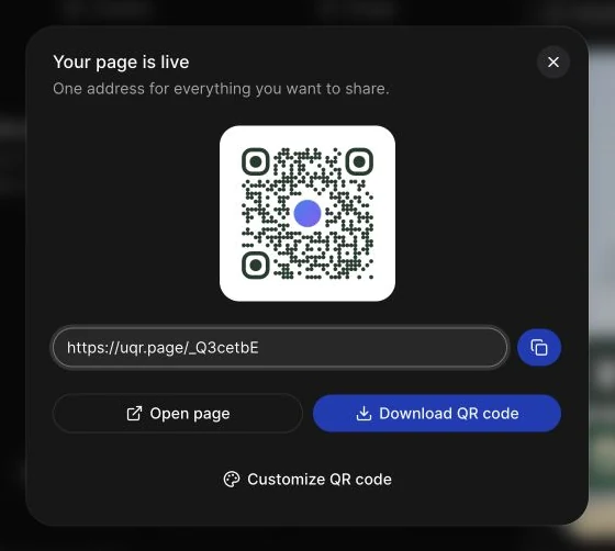
After the first publication, the sharing dialog lets you copy the link, open the page, download the QR, or return to customize the QR. The editor retains the saved page instead of clearing the form.
Later edits use Save. They update that same page and preserve its short URL, so the QR you already printed continues to reach the updated content. Existing List of Links QR records open in the same builder, with their saved images, themes, social profiles, contact form, and link settings.
The same page settings are available through the API and MCP
If you automate page creation, the builder continues to use the existing List of Links QR type. The REST API and MCP support the new appearance settings too: favicon or uploaded-image icons, per-link colors and gradients, button animations, background layout, and avatar shape and framing.
API and MCP access is available on Pro and Business. See the API documentation for the supported fields. When updating a page programmatically, read its current values first: sending a replacement theme or link list replaces that whole value, so retain settings you want to keep.
Ready to build yours? Create a List of Links page, or open an existing List of Links QR from My QR codes. Add your content, check the preview, design the code, and publish when it is ready.